
You designed a beautiful office interior. You chose the right furniture and a paint palette that reflects your culture. Then, just before the building inspection, you realize you need room identification signage.
In a rush, many business owners order the cheapest option online. The result is often a stark, industrial blue plastic sign that clashes with the lobby.
It does not have to be this way.
For architects and business owners sourcing ADA signs in Madison, WI, there is a misconception that accessibility requires ugliness. Many believe the Americans with Disabilities Act (ADA) mandates a specific “hospital” look. This is false.
The ADA mandates function, readability, and contrast. It does not mandate that your brand identity must suffer. By understanding the rules, you can design ADA signs that serve your customers and your brand simultaneously.
Do ADA Signs Have to Look Generic?
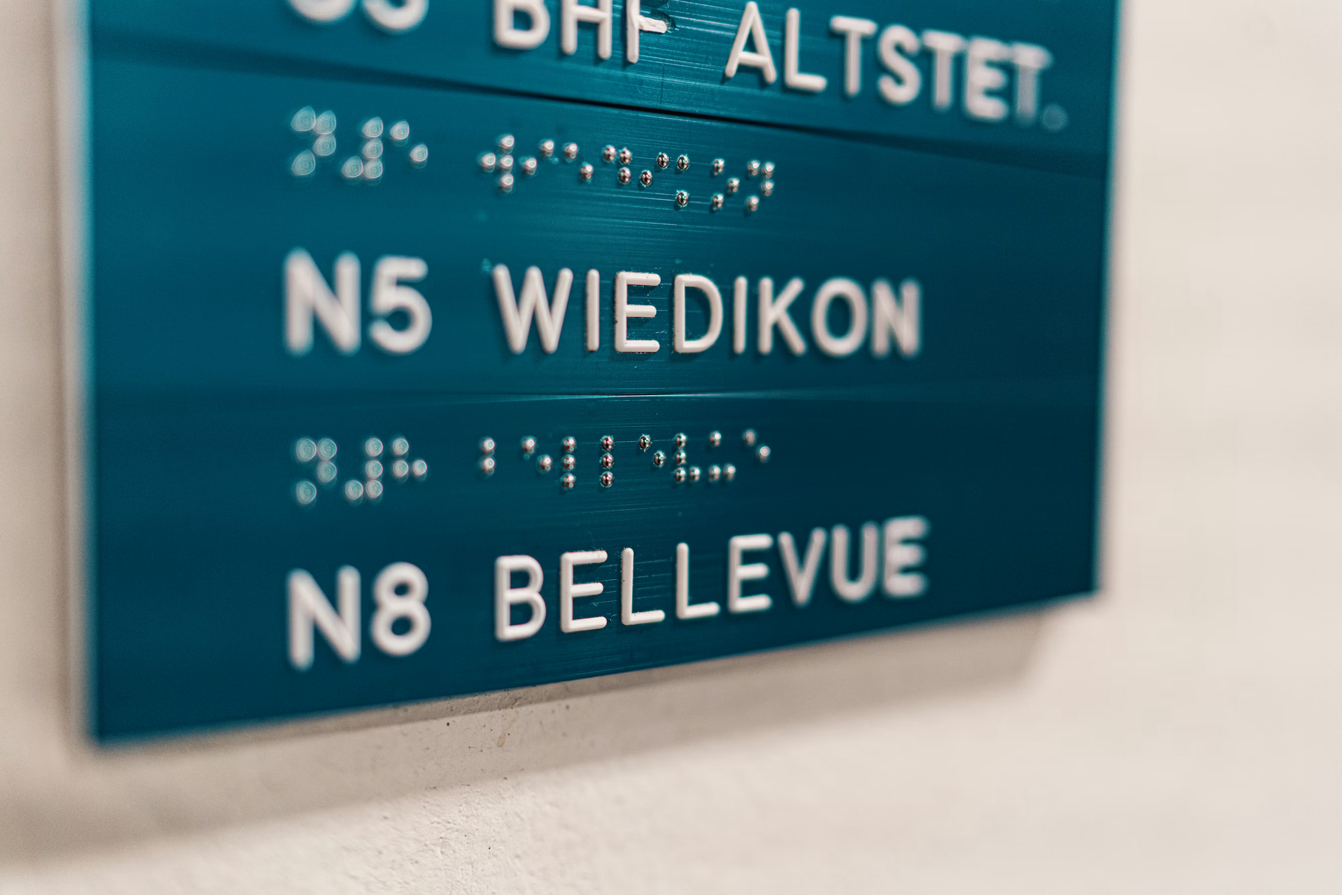
When people search for “ADA signs near me,” they often picture the generic signage found in high school hallways. These signs usually feature white Helvetica text on a navy blue background.
While those signs are compliant, they represent the minimum standard. The regulations set by the Department of Justice allow for significant creativity regarding materials, shapes, and colors. The goal is to ensure a person with a visual impairment can navigate a building safely. As long as your signage achieves this through specific technical criteria, the aesthetic choices remain yours.
What Are the ADA Signage Requirements?
To design custom ADA signs in Madison, WI that pass inspection, you must adhere to specific technical guidelines. Understanding these rules is the first step toward creative freedom.
- High contrast is critical: Visual characters must contrast with the background (recommended 70% contrast ratio). This does not mean black and white. You can use dark charcoal text on light wood grain or brushed aluminum on matte black.
- Tactile characters and braille: Permanent room signs require characters raised by at least 1/32 of an inch. They must be accompanied by Grade 2 Braille, which must be domed (not flat) for readability.
- Sans serif fonts: Script or decorative fonts are not permitted for the tactile portion. You must use a clean, sans-serif font. However, you can typically use your branded font for a supplemental visual section of the sign.
- Non-glare finish: The background and characters must have a matte finish. Highly reflective materials create hotspots under overhead lights, making the sign difficult to read.
How Can I Customize ADA Signs?
Once you understand the requirements, you can move beyond the “cookie-cutter” mentality and treat signage as an architectural feature.
Select premium materials
The easiest way to upgrade the look is to change the substrate. Instead of standard plastic, consider materials that match your interior design.
- Frosted acrylic: Offers a sleek, modern look for tech offices.
- Metal laminates: Brushed gold, silver, or copper adds prestige.
- Wood and stone: High-quality laminates can mimic wood grain or stone while providing necessary durability.
Add layering and depth
Standard signs are often a single flat layer. Custom ADA signs in Madison, WI often utilize multiple layers. A backplate made of clear acrylic with a second layer of wood veneer creates a sophisticated, architectural look. This adds visual interest and shadows, making the sign feel like a permanent fixture rather than a temporary sticker.
Integrate brand colors
You are not stuck with “safety blue.” You can color-match the background to your corporate palette. If your brand color is forest green, use that as your background. Simply ensure the text on top provides enough contrast. This ensures your wayfinding system feels like an intentional part of your branding strategy.
Where Should ADA Signs Be Installed?
Designing a beautiful sign is only half the battle. If it is installed incorrectly, you remain non-compliant.
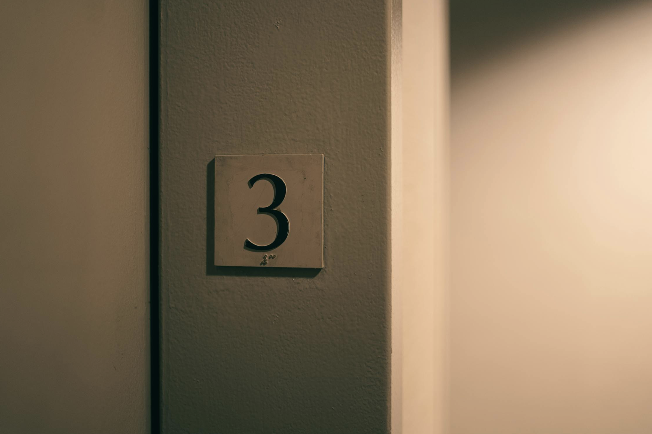
ADA signs marking a permanent room must be installed on the wall adjacent to the latch side of the door. They cannot be on the door itself because a swinging door forces a person who is blind to stand in the path of the door to read the sign.
There are also strict height requirements. The tactile characters must be located between 48 inches and 60 inches above the finished floor. This ensures they are reachable for a person in a wheelchair and readable for a person standing.
Local building inspectors in Madison and Milwaukee are thorough. Working with a partner who understands local enforcement is critical to getting your Certificate of Occupancy on the first try.
Why Inclusivity is Good Business
Upgrading your signage is about more than avoiding a fine. It is about the message you send to your visitors.
When you invest in high-quality ADA signs in Madison, WI, you signal that you care about the experience of every person who enters your building. You demonstrate that accessibility was not an afterthought. You show that you value detail, quality, and inclusivity.
A generic sign says you did the bare minimum. A custom sign says you care about the environment you create.
Your Local Resource for Compliant Creativity
Navigating the intersection of federal law and interior design can be complex. You do not have to choose between a beautiful office and a compliant one. By using premium materials and precise installation, you can meet every legal requirement while enhancing your professional image.
Madison Sign Studios believes in crafting connections through better visuals. We specialize in designing and fabricating custom ADA signs in Madison, WI that merge strict compliance with distinctive design. From the initial site survey to the final expert installation, our team ensures your business stands out for the right reasons.